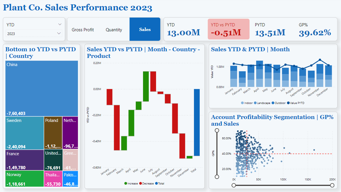
This dashboard, built using Power BI, provides an interactive analysis of Plant Co.’s sales, quantity, and gross profit performance. Starting with data loaded from Excel, I cleaned and prepared the dataset by renaming columns, removing duplicates, and verifying data types. To enhance the analysis, I created calculated columns, a date table, and key measures for metrics like year-to-date (YTD) and prior year-to-date (PYTD) sales.
The dashboard includes dynamic features, such as switch measures for toggling between metrics, slicers for selecting time periods and values, and conditional formatting for key visuals. I used various chart types—treemap, waterfall, scatter, and line—to visualize trends and comparisons, with a focus on a clean, user-friendly design. This project helped me advance my skills in data modeling, measure creation, and Power BI visualization techniques.